20 个免费的数据可视化工具
1. Zoho Reports

Zoho Reports is an online reporting and business intelligence service that helps you easily analyze your business data, and create insightful reports & dashboards for informed decision-making. It allows you to easily create and share powerful reports in minutes with no IT help.
2. Visulize Free

Visualize Free is a free visual analysis tool based on the advanced commercial dashboard and visualization software developed by InetSoft, an innovator in business intelligence software since 1996. Visualization is the perfect technique for sifting through multi-dimensional data to spot trends and aberrations or slice and dice data with simple point-and-click methods.
3. TimeFlow

TimeFlow Analytical Timeline is a visualization tool for temporal data. his tool is currently in alpha version so there is a chance of finding glitches. It provides five different displays: timeline view, calendar view, bar chart view, and table view.
4. Gnuplot

Gnuplot is a portable command-line driven graphing utility for Linux, OS/2, MS Windows, OSX, VMS, and many other platforms. The source code is copyrighted but freely distributed (i.e., you don’t have to pay for it). It was originally created to allow scientists and students to visualize mathematical functions and data interactively, but has grown to support many non-interactive uses such as web scripting. It is also used as a plotting engine by third-party applications like Octave. Gnuplot has been supported and under active development since 1986.
5. Dipity

Dipity lets you create a free digital timeline. It allows creating, sharing, embedding and collaborating on an interactive and visually attractive timelines has the ability of integrating video, audio, images, text, links, social media, location and timestamps etc.
6. Gri

Gri is an extensible plotting language for producing scientific graphs, such as x-y plots, contour plots, and image plots.
7. Easel.ly

Easel.ly is a simple web tool that empowers anyone to create and share powerful visuals (infographics, posters)… no design experience needed! We provide the canvas, you provide the creativity.
8. D3.js

D3 is a small, free JavaScript library for manipulating HTML documents based on data. D3 can help you quickly visualize your data as HTML or SVG, handle interactivity, and incorporate smooth transitions and staged animations into your pages.
9. Creately
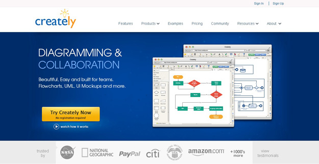
Creately lets you crate beautiful diagram, flowcharts, UML, UI mockups and many more. It offers 50+ types of diagrams with specialised features to help you draw fast and better, it offers real time collaboration and projects help you work with clients and colleagues .
10. Open Graphiti

OpenGraphiti is a free and open source 3D data visualization engine for data scientists to visualize semantic networks and to work with them. It offers an easy-to-use API with several associated libraries to create custom-made datasets. It leverages the power of GPUs to process and explore the data and sits on a homemade 3D engine.
11. Humble Finance

HumbleFinance is an HTML5 data visualization tool that looks and functions similar to the Flash chart in Google Finance. It makes use of the Prototype and Flotr libraries and is not limited to displaying financial data but any two 2d data sets which share an axis.
12. Fusion Table

Fusion table is new service by Google, Fusion Tables is an experimental data visualization web application to gather, visualize, and share data tables. You can create all kinds of layouts with fusion tables, even custom ones; and you can analyze millions of rows if necessary.
13. Gephi

Gephi is an interactive visualization and exploration platform for all kinds of networks and complex systems, dynamic and hierarchical graphs. Gephi, a graph-based visualiser and data explorer, can not only crunch large data sets and produce beautiful visualizations, but also allows you to clean and sort the data.
14. Open Refine

OpenRefine (formerly Google Refine) is a powerful tool for working with messy data: cleaning it; transforming it from one format into another; extending it with web services; and linking it to databases likeFreebase.
15. Raw

Raw is a free and open source web application for visualizing data flexibly and as easy as possible. It actually defines itself as “the missing link between spreadsheet applications and vector graphics editors”. The application works by loading a dataset by copy-posting or drag ‘n’ dropping and allows us to customize the view/hierarchy.
16. R Project

R is a free software environment for statistical computing and graphics. It compiles and runs on a wide variety of UNIX platforms, Windows and MacOS.
17. Exhibit

Exhibit lets you easily create web pages with advanced text search and filtering functionalities, with interactive maps, timelines, and other visualizations.
18. JavaScript InfoVIS Tool

The JavaScript InfoVis Toolkit provides tools for creating Interactive Data Visualizations for the Web. This library has a number of unique styles and swish animation effects, and is free to use.
19. Pizza Pie Charts

Pizza Pie Charts is a responsive Pie chart based on the Snap SVG framework from Adobe. It focuses on easy integration via HTML markup and CSS instead of JavaScript objects, although you can pass JavaScript objects to Pizza as well.
20. Axiis

Axiis is an open source data visualization framework designed for beginner and expert developers alike. Axiis gives developers the ability to expressively define their data visualizations through concise and intuitive markup.