15个最实用的数据可视化工具
Most Useful Tools for Data Visualization
在这篇文章中,我们收集了15个最有用的数据可视化工具,用于展示图表。希望大家能够喜欢!
Fusion Charts Suit XT

FusionCharts Suite XT is a professional and premium JavaScript chart library that enables us to create any type of charts. It uses SVG and has support for 90+ chart types, including 3D, gantt, funnel, various gauges and even maps of world/continents/countries/states.
Pizza Pie Charts

Pizza Pie Charts is a responsive Pie chart based on the Snap SVG framework from Adobe. It focuses on easy integration via HTML markup and CSS instead of JavaScript objects, although you can pass JavaScript objects to Pizza as well.
ZingChart
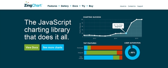
ZingChart is a JavaScript charting library and feature-rich API set that lets you build interactive Flash or HTML5 charts. It offer over 100 chart types to fit your data.
Visual.ly

Visual.ly is a combined gallery and infographic generation tool. It offers a simple toolset for building stunning data representations, as well as a platform to share your creations. This goes beyond pure data visualisation, but if you want to create something that stands on its own, it’s a fantastic resource and an info-junkie’s dream come true!
Bonsai

Bonsai is an open-source JavaScript library for creating graphics and animations. The library renders the outputs using SVG and comes with an intuitive, feature-rich API. There is support for creating simple shapes (rectangle, circle, ellipse, etc.) with specific functions and a path() function exists for drawing any custom shapes. It is possible to apply colors, gradients and filters (grayscale, blur, opacity and more) to these shapes. Many mouse (or touch) and keyboard events are already built-in to the library and they can be managed easily.
Dipity

Dipity allows you to create rich interactive timelines and embed them on your website. It offers a free version and a premium product, with the usual restrictions and limitations present. The timelines it outputs are beautiful and fully customisable, and are very easy to embed directly into your page.
Highcharts
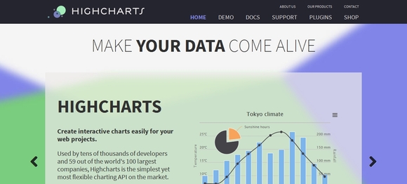
Highcharts is a JavaScript charting library with a huge range of chart options available. The output is rendered using SVG in modern browsers and VML in Internet Explorer. The charts are beautifully animated into view automatically, and the framework also supports live data streams.
Raw

Raw is a free and open source web application for visualizing data flexibly and as easy as possible. It actually defines itself as “the missing link between spreadsheet applications and vector graphics editors”. The application works by loading a dataset by copy-posting or drag ‘n’ dropping and allows us to customize the view/hierarchy. Raw is based on the popular D3.js and supports lots of different chart types like bubble, treemap, circle packing and more. Installing Raw is pretty straightforward as everything works client-side.
iCharts

The iCharts service provides a hosted solution for creating and presenting compelling charts for inclusion on your website. There are many different chart types available, and each is fully customisable to suit the subject matter and colour scheme of your site.
Smoothie Charts

Smoothie Charts is a really small charting library designed for live streaming data. Joe Walnes wanted to show real time streaming data pushed over a WebSocket. Although many of the charting libraries allow you to dynamically update data, none have really been optimized for a constant stream of data. Smoothie Charts only works on Chrome and Safari. And it doesn’t support legends. Or pie-charts. In fact, it’s inferior in virtually every way to a library like Flot. But, it’s very good at displaying streaming data.
BirdEye

BirdEye is the Declarative Visual Analytics Library. It is a community project to advance the design and development of a comprehensive open-source information visualization and visual analytics library for Adobe Flex. The action script-based library enables users to create multi-dimensional data visualization interfaces for the analysis and presentation of information.
Gephi

Gephi is an interactive visualization and exploration platform for all kinds of networks and complex systems, dynamic and hierarchical graphs. Runs on Windows, Linux and Mac OS X. Gephi is open-source and free.
JP GRAPH

JpGraph is an Object-Oriented Graph creating library for PHP >= 5.1 The library is completely written in PHP and ready to be used in any PHP scripts (both CGI/APXS/CLI versions of PHP are supported).
POLYMAPS

Polymaps provides speedy display of multi-zoom datasets over maps, and supports a variety of visual presentations for tiled vector data, in addition to the usual cartography from OpenStreetMap, CloudMade, Bing, and other providers of image-based web maps.
QUADRIGRAM
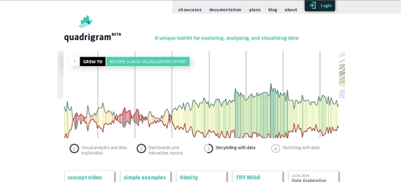
Quadrigram unique toolkit for exploring, analyzing, and visualizing data.