20个响应式CSS Grid系统
1. ChewingGrid

ChewingGrid is a CSS grid for card listing design, like videos, tiles, or article lists. It doesn’t require media queries, but it adjusts based on the maximum number of columns, and minimum and maximum card width. Chewing-grid provides atomic classes ready to use in your HTML (1 to 12 columns and widths in 50px intervals). You can also use it with Sass to generate your own classes, or even to build a custom semantic grid.
2. Motherplate
Motherplate is a bare bones HTML5, CSS3, and SCSS responsive boilerplate. It doesn’t include any visual styling or components, just bare bones CSS to get started with.
3. Lemonade

Lemonade is a a simple, flexible and easy-to-customise grid system. It was created in order to give designers & developers a kickstart with their projects. It currently supports Chrome, Firefox, Safari, Opera & IE 9+, also supports major phone devices too. With Lemonade you can either use the pre-made 12 columns or create your own columns.
4. Reverie

Reverie Framework is an extremely versatile HTML5 WordPress framework based on ZURB’sFoundation, a powerful tool for building prototypes on any kind of devices. Reverie Framework inherits all the cool features from Foundation, and packs with several other interesting features to optimize the experience for WordPress and HTML5. Including customized output for WordPress menus, caption and pagination.
5. Jeet

Jeet is the most advanced, yet intuitive, grid system on the market today. You can think of it like the spiritual successor to Semantic.gs. By making use of the power of pre-processors, we can now pass real fractions (or float numbers) as context that generates a percentage based width and gutter for grids. Jeet allows you to express your page grid the same way a human would describe it. No more needlessly nesting elements. No more rigid twelve column rules. Enjoy building faster with less code, and more flexibility with Jeet.
6. 1KB Grid

Simple grid system inspired by the the 1KB CSS Grid designed to utilize Sass to remove unnecessary classes from the HTML markup and make customization easier. The best part is that it’s not exactly 1KB now! Even better than the best part is that it’s been extended to support fluid grids as well.
7. Unsemantic

Unsemantic is a fluid grid system that is the successor to the 960 Grid System. It works in a similar way, but instead of being a set number of columns, it’s entirely based on percentages.
8. Bourbon Neat

Neat is a semantic grid framework built on top of Sass and Bourbon. It is simple enough to get you up and running in minutes, and powerful enough to handle any responsive layout you can dream of.
9. Herow

Herow is a time-saving Sass grid system. Herow provides mixins that are simple to use and easy to customize. It also provides atomic mixins, that are ideal to deal with responsive problematic. Last, but not least, you can generate atomic classes to play with it directly in CSS.
10. Rebar

Rebar is aimed to make responsive development more efficient and keep CSS organised. The idea is to setup a list of breakpoints and assign container or grid settings for each breakpoint at one time. It use padding for gutter, works the same way as Bootstrap 3 grid system does. So if you already familiar with Bootstrap, you will find Rebar is easy to use and far more flexible.
11. Sassline

Sassline makes it easy to create a baseline grid for your text using Sass and rems. It includes a responsive modular-scale and a meticulous vertical rhythm. Sassline lets you set a modular-scale for each of your breakpoints and easily work from these values to size your type. This combined with the baseline grid allows you to have harmonious proportions across all aspects of your website.
12. Skelton

Skeleton is a small collection of CSS files that can help you rapidly develop sites that look beautiful at any size, be it a 17″ laptop screen or an iPhone. Skeleton is built on three core principles: responsive grid down to mobile, fast to start and style agnostic.
13. Gridism

Gridism is a simple responsive grid that’s easy to use. On screens smaller than 568px wide, grid units are stacked, while on larger screens grids can have a maximum width of either 978px or 1140px.
14. One % CSS Grid

One% CSS Grid is a percentage based 12 column fluid CSS grid system. It’s been designed as a base for building responsive web layouts easily, quickly and with minimum effort. It has two starting options, one which fits 1280px screens (in full screen view) and another one which fits 1024px screens (in full screen view).
15. Columnal

Columnal is a grid system has borrowed from cssgrid.net, while some code inspiration (and the idea for subcolumns) have been taken from 960.gs. Columnal makes web design easier by making your grids fluid, dynamically changing based on the browser size (and even switching to a mobile-style layout if the width is small enough).
16. Less Framework

Less Framework is a CSS grid system for designing adaptive web¬sites. It contains 4 layouts and 3 sets of typography presets, all based on a single grid. The goal of Less Framework is to make building websites with multiple layouts efficient, and to make the layouts feel consistent.
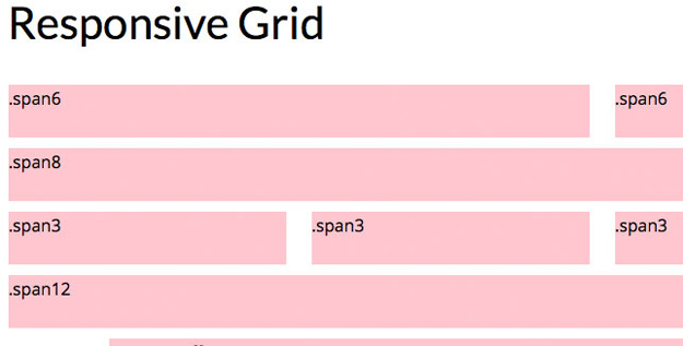
17. Responsive Grid System

Responsive Grid System is a fluid grid CSS framework for fast, intuitive development of responsive websites. Available in 12, 16 and 24 columns with media queries for all standard devices, clearfix, and optional reset.
18. Ingrid
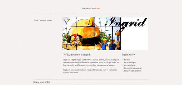
Ingrid is a lightweight and fluid CSS layout system, whose main goal is to reduce the use of classes on individual units. Making it feel a bit less obtrusive and bit more fun to reflow for responsive layouts. Ingrid is also meant to be an extendable system, easy to customize to your own needs.
19. The Square Grid

The Square Grid is a simple CSS framework based on 35 equal-width columns. You can use the grid in a variety of columns: 18, 12, 9, 6, 4, 3, 2, with the total width of the grid is 994px – which the majority of modern monitors will support. The grid is equipped with a 28px baseline-grid for a smooth vertical rhythm. Each block (DIV) is defined with a margin of 1 square (28px) from the next block.
20. Fluid Baseline Grid

The Fluid Baseline Grid system was built with typographic standards in mind and combines principals of fluid-column layouts, baseline grids and mobile-first responsive design into a resolution independent and device agnostic framework. It is packed with CSS normalization, beautiful typographic standards, corrected bugs, common browser inconsistencies and improved usability.