2014年15个新鲜的CSS框架
1. Concise

Concise is built so that you have a lot of options handed to you out of the box. It comes built from the ground-up to be mobile friendly and includes a simple grid system, beautiful typography, and a few other bells and whistles. However, it is also built super lean, with a little over 2,000 thousand lines of CSS, and a few hundred lines of JavaScript. Concise is specifically built to be customized, tinkered with, and hacked.
2. Kouto Swiss

Koutu Swiss is a CSS framework for Stylus. It gives you tons of mixins, functions and utilities for faster coding. To use kouto swiss with third party tools likeCodekit or Prepros, you should include kouto swiss on your project by yourself. You can download it on github.
3. KickStart

Kickstart is an easy to theme front-end framework that works with either semantic CSS mixins or CSS classes. It includes just one CSS file and one JavaScript file, with no jQuery required. Kickstart targets modern browsers to give you the latest, most robust features. For targeting older browsers, former releases of Kickstart are made available via the documentation. Kickstart is as simple as one JavaScript and one CSS file.
4. Tachyons

Tachyons is a performance-first CSS framework that includes simple, fast modules and components. It’s easy to get started with and only 6.2kb when gzipped.
5. Material UI

Material UI is a CSS framework and set of React components that incorporate Google’s Material Design. Components include buttons, drop downs, menus, switches, toolbars, and more.
6. Tuktuk

Tuktuk is a lightweight object-oriented CSS framework for easily creating responsive and fully extensible websites. It includes layouts up to twelve columns, as well as forms, buttons, tables, typography, and more.
7. Base

Base is developed in SASS / LESS, a powerful CSS pre-processor that helps you write cleaner, more organized, well structured CSS that you can easily maintain over time. Base supports all major browsers and legacy browsers such as IE7.
8. Unsemantic

Unsemantic is a CSS framework that is a successor to the 960 Grid System. It relies on percentages rather than a fixed number of columns, and was built with extensibility in mind.
9. Curmpet

Crumpet is a deliciously simple SASS/SCSS responsive framework that keeps your HTML clean & stays out of your way. Built to make use of placeholder selectors to reduce the size of your HTML markup. No one likes messy HTML. Creating website layouts fast & responsive will be a breeze. Not windy like it is in Autumn. Allows you the freedom to do what you want with your code.
10. Applepie
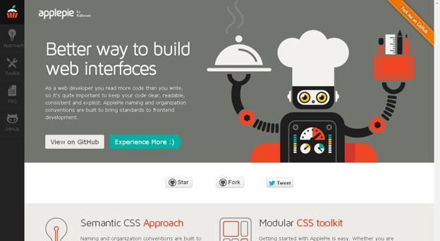
ApplePie Toolkit is modular and responsive CSS framework. Getting started with ApplePie is easy. Whether you are building a simple site with a ‘default’ UI, or you are a master of SASS, building a new app – this toolkit will help you get up and running! Simplest way to get started – straight CSS Toolkit version that includes everything you need to do rapid prototyping. Just grab a CSS file (applepie.css or applepie.min.css), in
11. DeCSS

Decss is a mostly CSS-driven presentation framework that uses CSS3 for transitions. It offer responsive layouts, flexbox for content layout, and even supports presenter notes.
12. Pixate

Pixate is a free framework that lets you style your native iOS views with stylesheets, making it easier to create powerful, engaging user experiences. It includes the Freestyle companion CSS toolkit, too.
13. Motherplate

Motherplate is a bare bones HTML5, CSS3, and SCSS responsive boilerplate. It doesn’t include any visual styling or components, just bare bones CSS to get started with.
14. Hoisin

Hoisin is a very simple responsive front end mini framework made to kick start your web project, written in Sass. This framework was created as an alternative to more complex and bloated front end frameworks, with a focus on organisation, speed and flexibility.
15. Sculpt

Sculpt is a lightweight, mobile first, responsive HTML, CSS and SASS framework. It has been written to cater for devices with small screen sizes first, with more complexity being added through media queries as screen real-estate increases. With three grid sizes (732px, 960px and 1140px) built in and active depending on your device’s screen size you can be sure your content will be well presented no matter the conditions.