10个响应式的jQuery导航菜单资源
1. Responsive Multi-Level Menu
The main idea is to save space for menus that have a lot of content and sub-levels. Each sub-level in this menu will be shown in its own context, making the “parent” level disappear. This is done with subtle animations that are defined in separate animation classes. The menu is fluid so that it can be used easily in a responsive layout.

2. Drop-Down Navigation: Responsive and Touch-Friendly
Here comes the promised super lightweight jQuery plugin which I called DoubleTapToGo.js and it is only 550 ridiculous bytes in size when minified.
This jQuery plugin helps you create usable multi-level dropdowns which are touch-friendly and responsive.

3. MeanMenu – A free jQuery Responsive Menu plugin
MeanMenu is a free jQuery Responsive Menu plugin to create better navigation for your mobile visitors without media queries. And yes, it works with jQuery 2.0 – obviously IE 7 & 8 will not work.

4. Flaunt.js for stylish responsive navigations with nested click-to-reveal
Flaunt.js is a jQuery script that allows you to create a responsive, nested navigation out the box. Flaunt was built to overcome responsive design challenges which faced a huge percentage of websites. This challenge was to show nested navigation items on click-demand, without the event taking you through to the page you’ve pressed…

5. FlexNav – Flexible, Device Agnostic Navigation
The mock navigation you see above is a mobile-first example of using media queries and javascript to make a decent site menu with drop downs. Special attention is paid to touch screens using touch events with tap targets (the key feature of FlexNav).

6. Responsive Mobile Menu
The easiest way to implement user-friendly responsive navigation optimized for mobile devices using HTML5, CSS3 and jQuery.
Features: Light-weight code; Multiple menus on the same page supported; 100% functionality in all actual mobile and desktop web browsers supporting HTML5 and CSS3; + more

7. jQuery Navobile
jQuery Navobile – a jQuery plugin that makes mobile navigation easy. Navobile uses CSS to apply CSS3 translations, Mobile device detection and fixing the position of nav. In the CSS file we used for this demo and the one that is included in the src folder the mobile break point is at 765px using a media query, you can of course change this to suit your needs.

8. Sidr – A jQuery plugin for creating side menus
This jQuery plugin is an easy method for creating side menus and the easiest way for doing your existing menu responsive. You will be able to create multiple sidrs on both sides of your web to make responsives menus (or not, it works perfectly on desktop too)

9. Responsive Side Menu with jQuery
This is a tutorial written in french on how to design a sidebar jquery animated menu following the rules of responsive webdesign. Demo and source files are also available

10. Horizontal Drop-Down Menu
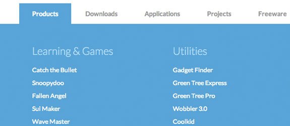
This large horizontal drop-down menu simply shows the sub-menu when an item gets clicked. It’s inspired by the Microsoft.com drop-down menu. Some example media queries show how to adjust the menu for smaller screens.
