用于测试响应式网站的在线工具
以下几于用于测试响应式网站的在线工具。
Responsinator
The Responsinator helps website makers quickly get an indication of how their responsive site will look on the most popular devices.

http://mattkersley.com/responsive/
This tool has been built to help with testing your responsive websites while you design and build them.
You can enter your website’s URL into the address bar at the top of this page (not your browser’s address bar) to test a specific page.

Responsivepx
It’s a web-based tool where you enter the URL (local or online; both work) and use the controls to adjust the width and height of your viewport to find exact breakpoint widths in pixels. Then use that information in your media queries to create a responsive design.

http://responsivetest.net/
ResponsiveTest is a simple tool allowing us to view a responsive web design in various resolutions.

Screen Queri
Pixel Perfect Media Query Debugging Tool Test Responsive Designs Across 60+ Device Viewports.

Responsive
A handy tool for responsive design testing. RWD Bookmarklet Drag the link above into your bookmarks bar

CSS Chopper Responsive
An easy to use tool for checking and testing your responsive design in various resolutions.

http://responsivetest.com/
Responsive design allows a single Web page to be optimized for multiple devices: desktop, tablets, smart phones.

https://quirktools.com/screenfly/
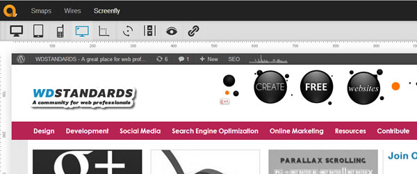
Last but not least, a great tool for testing and you can share with stakeholders for immediate feedback.