Update: iOS 7 introduces a number of new app-icon sizes. The specific sizes mentioned in this post may not be useful any longer. However, feel free to read on for some basic theory about icons, regardless of size or intended use.
Let’s say you’re working on an icon for an iOS app. The app is universal, so it should run on all iPhones (and iPod touches), and on the iPad. As a designer, you’re used to drawing icons at various sizes; this is a big part of what “icon design” is (as opposed to other types of illustration).
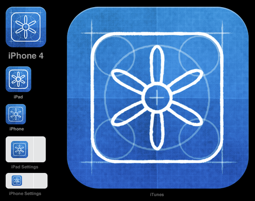
Here’s my PSD file for an iOS icon I drew the other day:
This is based on Sebastiaan de With’s excellent iPhone icon PSD file, which is a living document and will be updated as things change in iLand. You absolutely need this or something like it.
Note that your icons will have a rounded-rect mask applied to them, whatever you do. So you can leave your icon totally square, but if you want a nice inline shadow at the top (I do) you’ll have to bake the top of the rounded shape into your icon.
Let’s walk through all the different sizes and how they’re used:
- 57 px, iPhone – Good ol’ classic.
- 114 px, Retina iPhone
- 72 px, iPad
- 144 px, Retina iPad
- 29 px, iPhone Settings/Spotlight, iPad Settings – Used in these table views. Minor, but still important!
- 58 px, iPhone 4 Settings/Spotlight/Notifications – That’s right, you have to make both 57 and 58 px versions of your icon – d'oh! Good luck aligning this if there’s a line running down the middle of the icon.
- 48 px, iPad Spotlight – Yup, the iPad uses a different size for Spotlight and Settings. Apple’s docs actually say the icon is 50 px, but then there’s this note: The final visual size of this icon is 48 x 48 pixels. iPhone OS trims 1 pixel from each side of your artwork and adds a drop shadow. Be sure to take this into account as you design your icon. So, leave extra room around your icon.
- 96 px, Retina iPad Spotlight. See note 7 above, and remember the edge will be trimmed by 2 px on each side.
- 22 x 29 px document icon, iPhone
- 44 x 58 px document icon, Retina iPhone
- 64 px document icon, iPad
- 320 px document icon, iPad
- 640 px document icon, Retina iPad
- 512 px, iTunes – Used in iTunes and in the App Store, where it’s sized down to 175 px. Sadly, you can’t provide the 175 px version directly.
- 1024 px, Retina iTunes
(By the way, if you’re working on a webapp icon, I’m not aware of a way to specify different sizes for those. Apple appears to provide a single, 128 px image which then gets scaled down. Update: Apple has a dev document on specifying web clip icons.)
The jumble of files you’ll end up with is not all that new. On the Mac, we’ve been creating icons at multiple sizes for decades. They get wrapped in a .icns file; this fact doesn’t really help the designer much. The difference is that while .icns files serve as a sort of mipmap, specifying sizes between which the icon should be scaled, iOS icon sizes are for the most part defined by their use: this size goes here, that one goes there.
How does all this relate to resolution independence? Well, RI is really a goal, not a technique. It means having resources which will look great at different sizes. This is partly accomplished by using vector art for shapes (such as button icons) which get styled by the system. The typical tab bar or toolbar in an iOS app and Finder-style toolbar buttons are good candidates for PDF art (though vector files aren’t actually used in iOS apps due to performance considerations.) They’re simple “masks”.
Even so, they are usually designed with a target size in mind. It’s simply not possible to create excellent, detailed icons which can be arbitrarily scaled to very small dimensions while preserving clarity. Small icons are caricatures: they exaggerate some features, drop others, and align shapes to a sharp grid. Even if all icons could be executed as vectors, the largest size would never scale down well.
Here’s the icon for the Pictures folder in Mac OS X:
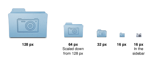
Note that scaling down works to about 64 px; after that, shapes have to be redrawn, simpler and clearer, in order to read. The sidebar version of the icon is entirely different, in fact; since we know it will be shown in the sidebar, it’s not so important that it look like a folder, and other features can be emphasized instead. Creating the large icon as a vector shape – which, to be clear, you should be doing! – won’t help where clarity is really needed: at small sizes. High-resolution displays will in fact make this problem more urgent because today’s 64 px is tomorrow’s 128 px. We’ll have to refine ever larger icons.
Update: to make this point even clearer, here’s what we’d get if we simply scaled down the big version of the icon:
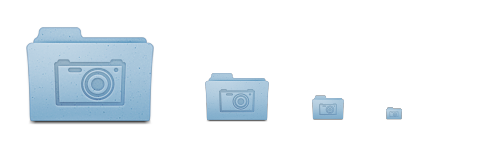
This is a very common method of using the “same” image at different sizes. It has recently been popularized in the world of icons by various utilities that aim to make easier the task of creating various iOS icon sizes. As shown above, this programmatic approach yields results noticeably worse than having a designer hint the shapes manually.
Another single-source-image approach one might consider is the reverse: creating a vector version optimized for a certain small size, then resizing that up infinitely, as needed. Here’s what that would give us:

I said you should be drawing the largest size as vectors – in Illustrator, or using Photoshop’s shape layers – because this is the least destructive, most editable way to work. Textures and frustrating little pixel adjustments can be done by hand. You’ll basically want to have one endlessly scalable version of the icon, full of glorious detail, but representing essentially the same shapes as the other sizes. The reason for this is that some day, Apple may call and ask you for a large App Store banner, a printable poster for their retail stores, or a twenty-foot decal for WWDC.