
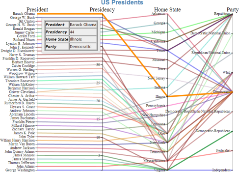
The Parallel Lines view is quickly becoming one of my favorite tools to show data with many dimensions. It’s ability to express many dimensions across vertical axis is quite powerful. What makes this visualization even more powerful is the fact that you can select ranges across each one of these axis to narrow down the subsets which are of interest.
However, the default Parallel Lines visualization lacked a few features that I wanted:
- The ability to handle categorical/ordinal data.
- General configurability.
- Opacity
- Dimensions and margins
- Color scheme
- Stroke Width
- Font sizes
- Mouseover events
- Highlight and increase opacity
- Display tooltips
So I started working to add these capabilities.
Here is an example, click on the image to go directly to the visualization itself:
Configurable Settings
The key sequence ALT-C will display/hide the configuration menu. When the visualization is within the Dex application, any setting changes will be persisted to the document when saved as an HTML asset. Saving to HTML is accomplished via Control-S from the visual itself within Dex.
Each main component can be dragged to the appropriate screen location. When saved to HTML, this placement will be retained.
Support for Categorical Data
Support for categorical data was added by first iterating over the data and determining which columns were numeric and which were categorical. Numeric column headers were stored in a list called numericHeaders.
    x.domain(dimensions = d3.keys(cars[0]).filter(function(d)
    {
      if(d === "name") return false;
if(contains(numericHeaders, d))
{
y[d] = d3.scale.linear()
.domain(d3.extent(cars, function(p) { return +p[d]; }))
.range([height, 0]);
}
else
{
y[d] = d3.scale.ordinal()
.domain(cars.map(function(p) { return p[d]; }))
.rangePoints([height, 0]);
}
return true;
}));
Numeric data gets mapped to a linear scale while categorical data is mapped to an ordinal scale.
However, we are not home free yet. Since this visual allows for selections within a scale, this code also required modification.
The brush routine also had to be modified to translate coordinates of the selection into the items within the categorical list which had been selected:
function brush()
{
  var actives = dimensions.filter(function(p) { return !y[p].brush.empty(); }),
      extents = actives.map(function(p) { return y[p].brush.extent(); });
foreground.style(“display”, function(d)
{
return actives.every(function(p, i)
{
// Categorical
if (!contains(numericHeaders, p))
{
return extents[i][0] <= y[p](d[p]) && y[p](d[p]) <= extents[i][1];
}
// Numeric
else
{
return extents[i][0] <= d[p] && d[p] <= extents[i][1];
}
}) ? null : “none”;
});
}
}
Tooltips
Tooltips were quite easy. Since I am using JQuery UI, it simply involves attaching a title with the text containing the tooltip I wish to display and telling JQuery to enable tooltips.
\$(function()
{
  \$(document).tooltip(
  {
    track : true
  });
});
Tracking is nice because it will cause the tooltip to move with the mouse.
In my case, I wanted a couple of things to happen when the mosue moved over a line:
- Change the opacity to 100%
- Enlarge the line by some percentage in order to make it pop.
- Display the tooltip.
This was easily accomplished by appending a title to the element which I wanted to associate with the tooltip and mouseover event. In this case, it was an SVG path element. I also associate mouseover and mouseout events with this path at the same time.
    foreground = svg.append("g")
      .attr("fill", "none")
      .attr("stroke-opacity", opacity/100.0)
      .selectAll("path")
      .data(cars)
      .enter().append("path")
      .attr("d", path)
      .attr("stroke", function(d, i) { return fill(i); })
      .attr("stroke-width", strokeWidth)
      .attr("title", function(d, i)
      {
        var info = "<table border=\"1\">";
        for (var key in cars[i])
        {
          info += "<tr><td><b><i>" + key + "</i></b></td><td>" + cars[i][key] + "</td></tr>"
        }
        return info + "</table>";
      })
      .on("mouseover", function()
      {
        d3.select(this)
          .style("stroke-width", strokeWidth + (strokeWidth/3))
          .style("stroke-opacity", 1.0);
      })
      .on("mouseout", function()
      {
        d3.select(this)
          .style("stroke-width", strokeWidth)
          .style("stroke-opacity", opacity/100);
      });
Since there might be many columns in a Parallel Lines visualization, I help the reader out by putting the associated data in a bordered table.
College Football
I love College football so I decided to put this visualization to the test on a very dense dataset from the Massey Polls.
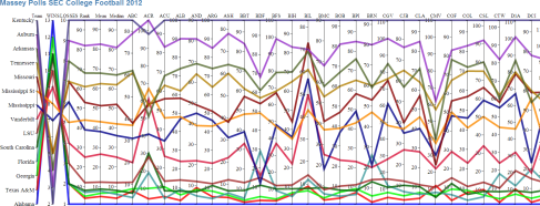
Click any of the visualization images to go to the interactive visualization.

This dataset contains all of the college teams and all of the polls rankings of each team. There are over 100 polls so it’s quite overwhelming. Here’s what it looks like with the Parallel Lines visual:
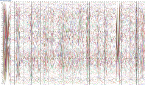
It is still overwhelming, but less so when expressed visually. Now lets reduce the dataset to some specific subsets of interest.
Teams with 2 or fewer losses:
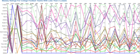
I found it quite interesting that some polls still ranked Notre Dame #1 after suffering a 42-14 loss to Alabama in the BCS championship. Either the numbers didn’t get reshuffled post-season or their computer models are severely out of whack.
Last, here is a view of just the SEC.
Notice that the scale is from 1st to last from the bottom up. You can see polls which consistently overrate and underrate SEC teams in this visual.
Thats all for now…
I hope you like the changes to Parallel Lines. Feel free to tweet, email or post any suggestions to the component.

I am in awe!
Well played sir. That is inspiring work. After a quick play with parallel lines a few months back I decided that they were a bit hard and implementing some features that I wanted was too difficult.
However, just your implementation of ordinal data alone makes me think I should revisit.
Many thanks for sharing.
Hey thanks!
I have found it to be a highly effective visual. The lack of ordinal data was a dealbreaker for me as well. Thats what is great about D3, its a framework rather than a canned set of visualizations. Don’t like it? Change it.
The other being how well D3 integrates with other HTML5 technologies.
Pat
Pingback: Over 2000 D3.js Examples and Demos | TechSlides
can we give some default brush for lines (Categorical and Numeric)
checkout http://syntagmatic.github.io/parallel-coordinates/ for another implementation of parallel coordinates (using canvas).
Julian